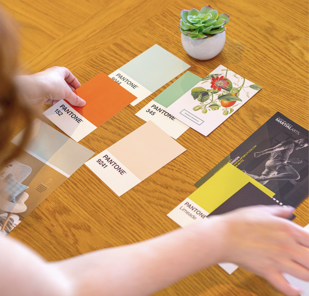
When you’re trying to decide on the perfect brand colours for your small business, I know how tempting it can be to go with a personal favourite – or just something you’ve seen and liked – and hope for the best.
However, if you want your branding to appeal to the right people, it’s important to be intentional in your colour choices and understand their meanings. Since colour is the first thing most people notice, using the right brand palette can instantly communicate meaning and help you make those all-important emotional connections with your audience. This is where colour psychology comes in.
What are your brand colours saying about your business? Here’s everything you need to know about the meanings and psychology of colour to help you create a meaningful brand palette for your business.
What is colour psychology and why is it important in branding?
“Colour is 85% of the reason you purchased a specific product.”
– NEIL PATEL
Colour psychology is the science bit that explains our emotional and behavioural responses to colours. Different colours can evoke different reactions, feelings, cultural associations and levels of recognition, all of which can influence our choices.
According to Neil Patel, “Colour is 85% of the reason you purchased a specific product.” The Pantone Colour Institute has also found that 95% of our decisions related to colour are made by our intuition and emotional factors, only 5% are rational.
So the considered use of colour is a powerful opportunity to communicate messages about your brand, what you have to offer and how you do business. It can help you stand out from the competition, create positive customer experiences and strengthen connections with your audience.
What do different brand colours mean?
It’s important to highlight that our own experiences, cultural differences, and personal associations can impact our individual responses to a particular colour. Red, for example, is deemed extremely lucky in China, where they associate it with money and prosperity. In the U.S., green has similar connotations. Yet, here in the UK, we don’t especially associate either of these colours with money and wealth.
The shade, tone and intensity of a colour can also affect the way we view it. For example, a light baby blue may be tranquil and nurturing, whereas a saturated cobalt blue will convey depth and confidence, and a darker, navy blue evokes feelings of trust and formality.
That being said, colour psychology looks at the more widely-associated brain responses to each of the key colours. So, to help you on your quest to find the best brand colours for your small business, here are the hidden meanings behind 14 of them. Some may seem obvious, others might surprise you.
Exciting Red

Using the colour red in your branding suggests: confidence, strength, power, action, heat, danger, urgency, empowerment, impact, boldness, passion, excitement, appetite, intensity, emotion
Red is a great colour choice for: entertainment companies, theatres, media brands, consumer food brands, restaurants and eateries, lingerie brands, arts venues, sports brands
Brands who use red in their logos include: Virgin, Coca-Cola, Pinterest, H&M, TED, Shakespeare’s Globe, Lego, HSBC, Devon Live, English Heritage, Costa Coffee, Heart FM, Kellogg’s, Vodafone, YouTube, Under Armour, Netflix, KitKat, Quicksilver, Shelter, Levi’s
Intelligent Blue

The colour blue is often used in branding to communicate: professionalism, reliability, security, formality, depth, intelligence, openness, trust, peace, tranquillity, health, stability, clarity, purity
Blue is an excellent brand colour for: social enterprises, tech businesses, finance companies, charities, medical industry, health & beauty brands, health spas, cleaning companies, estate agents, insurers, accountants, certain food & drinks brands
Examples of brands who use blue in their logo: Bombay Sapphire, NHS, Co-Op, Ford, Disney, McVities, Gap, British Airways, Dell, Boots, Barclays, The World Health Organisation, Panasonic, United Nations, Oral B, Facebook (Meta), Oreo, Nivea, WHSmith, P&O Cruises, Vaseline, RNLI, Dove, Montzuma’s, Purdy & Fig, Moo Free
Renewing Green

The colour green helps to convey: growth, nourishment, abundance, sustainability, nature, renewal, trust, tranquillity, peace, healing, wellbeing, balance, harmony, stability, revival, freshness, organic, environment
Green is a clear brand colour choice for many: organic food producers, flower farms, florists, nutritionists, grocers, eco-friendly brands, public gardens, environmental organisations, health coaches, spas, yoga instructors, grocers, health food brands, outdoor clothing, gardening brands
Examples of organisations who use green in their branding: Grace & Green, Waitrose, Greenpeace, Starbucks, The Body Shop, HolidayInn, National Trust, Spotify, Garnier, EatFresh, Lacoste, Tropicana, Simple, Whole Foods, Trip Advisor, Harrods, John Deere, Land Rover, Weleda, ACAI Outdoorwear, Beards & Daisies
Optimistic Yellow

The colour yellow is used in branding to convey: warmth, happiness, joy, optimism, youthfulness, brightness, sunshine, cheerfulness, satisfaction, positivity, energy, sociability, attention, information, intellect, creativity, freshness, affordability
Yellow is a great brand colour for: creatives, photographers, gift shops, children’s brands, baby boutiques, childcare companies, pet products, wellbeing coaches, travel agencies, holiday companies, affordable retailers, confectionery brands, fast food restaurants, everyday food brands
Examples of brands embracing yellow to help them stand out: Dogs Trust, McDonald’s, Yellow Pages, Morrisons, Mailchimp, Lidl, Singapore Airlines, Veuve Clicquot, BIC, Snapchat, Hertz, Ikea, UHU, National Geographic, Selfridge’s, Niwaki
Energising Orange

The colour orange inspires: fun, adventure, excitement, energy, warmth, sunshine, friendliness, vibrancy, playfulness, creativity, affordability, flavour, appetite, happiness
Orange makes an exciting brand colour for: food & drinks brands, toy companies, children’s & teen brands, family restaurants, budget brands, travel companies, fitness coaches, sports brands, leisure & recreation providers, streetwear brands, creatives
Examples of brands who use orange in their logos: Penguin, Hermès, SoundCloud, Fanta, GlaxoSmithKline, Etsy, Sainsbury’s, Zapier, National Youth Theatre, Harley-Davidson, Amazon, EasyJet, Timberland, SEMRush, Sally Hansen, Fossil, Monsoon, South West Lakes Trust, Effortless Foodie, Cornish Tea
Powerful Purple
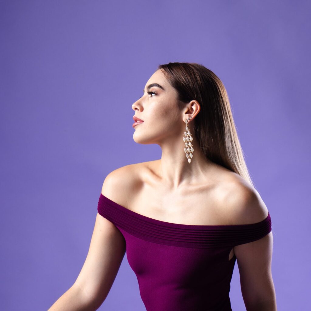
In branding, the colour purple conveys: tradition, spirituality, magic, power, nobility, royalty, luxury, quality, heritage, nostalgia, romance, glamour, creativity, depth, relaxation, intellect, excellence, achievement
Purple is a powerful brand colour for: high-end brands, events companies, arts venues, historical buildings, estate agencies, confectionary companies, beauty brands, luxury goods, jewellers, health spas, holistic therapists, spiritual brands, transformation coaches
Examples of famous brands who use purple in their logo: Asprey, Hitched, Cadbury, Crown Plaza, Greenwich Theatre, Zoopla, Brand Metrics, BBC Radio Devon, Claire’s, Monster, Hallmark, Premier Inn, Purple Bricks, Aussie Hair, Urban Decay, FedEx, Liberty, Goose Studios, The Editing Wolves
Thoughtful Pink
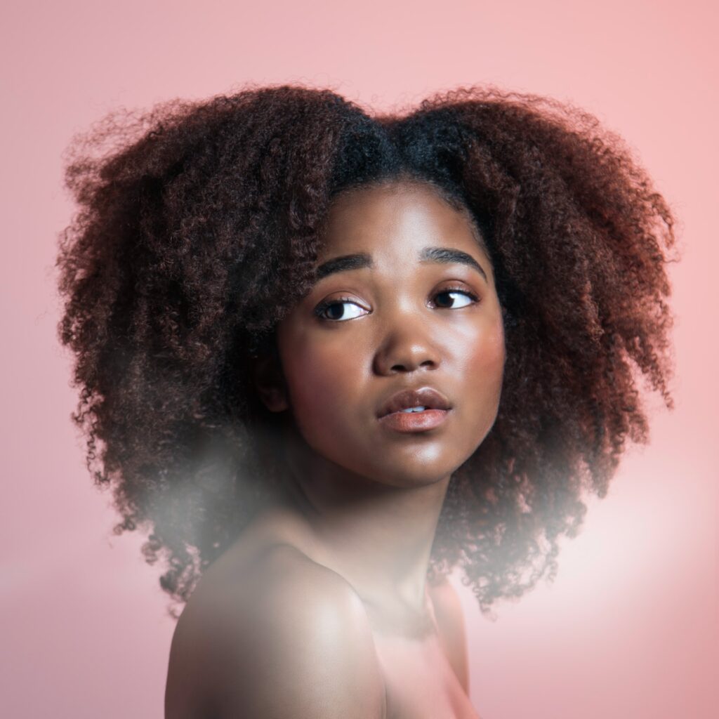
Different pinks can be used in your branding to suggest: fun, imagination, creativity, trendiness, pop culture, optimism, youth, innocence, sweetness, tenderness, kindness, caregiving, nurturance, motherhood, femininity, romance, love, intimacy, sentimentality
Various tones of pink or magenta make a lovely choice for: florists, cake designers, charities, maternity brands, events organisers, coaches, writers, entertainment companies, teen brands, stationery designers, fashion retailers, wedding businesses, beauty salons, cosmetics brands, toy companies, gifting brands, pâtisseries, boutique hotels
Examples of brands who use pink or magenta in their identities: Popsy Clothing, Barbie, Cancer Research UK, Peggy Porschen, HMV, Biscuiteers, Roxy, BBC iPlayer, Soho Theatre, Cosmopolitan, Miss Selfridge, T-Mobile, Victoria’s Secret, LG, Grind Coffee, Flo Health, The Happy Blossoms
Inspiring Teal

A shade of blue-green such as teal, aqua, mint, cyan or turquoise inspires: clarity, communication, vision, intuition, creativity, calmness, relaxation, healing, serenity, joy, friendship, freshness, energy, inspiration, knowledge, sophistication, emotional balance, wholeness, loyalty, youth, compassion
Teal and other forms of blue-green make a great choice for: communications companies, creative service providers, writers, designers, photographers, business coaches, travel companies, gift shops, home & lifestyle brands, therapists, treatment spas, watersports providers, surf schools
Examples of organisations with teal or blue-green branding: FSB (Federation of Small Business), Tiffany & Co, Vinted, BBC Two, Cathay Pacific Air, Siemens, Le Meridien, EE, Pampers, ESA, Deliveroo, Heinz Beanz, Canva, Fortnum & Mason, The Wildlife Trusts, Devon & Plymouth Chamber, Limelight Copy & Creative, Sabins Coffee
Enduring Brown

Using brown in your branding will convey: earthiness, depth, flavour, artisan, craftsmanship, skill, strength, durability, age, reliability, support, practicality, endurance, ruggedness, adventure, outdoors, nature, eco, organic, tactility, homeliness, wholesomeness, humility, heritage
Brown is a reliable brand colour choice for: small food producers, florists, outdoor clothing brands, activity leaders, adventure holiday companies, coffee brands, men’s grooming, beard care, leather goods, skilled makers and artisans, heritage crafts producers, restaurants & cafés, farm shops, bakeries, confectionery brands, wholefood brands
Examples of organisations using brown in their branding: Bloom & Wild, Nespresso, Kettle Chips, Ugg, Godiva, Holister, J.P. Morgan, UPS, M&Ms, Kew Royal Botanic Gardens, Nestle, Louis Vuitton, Ferrero, Darts Farm, The Raw Chocolate Company
Distinguished Black

Black in branding communicates: style, elegance, luxury, timelessness, mystery, sophistication, authority, power, boldness, edge, exclusivity, secrecy, formality, distinction, stability, seriousness, excellence, refinement
Black is an exquisite colour choice for: boutique hotels, luxury car brands, designer fashion, sports brands, luxury goods, premium food brands
Examples of brands who use mostly black: Komodo, John Lewis, Chanel, WWF, Patagonia, Vogue, Olay, Adidas, Cartier, Steiff, Dior, Tate, MAC, Harvey Nichols, Lancôme, Cowshed, ME+EM, Coaltown Coffee, Finisterre, Ethical Kind, Sancho’s (Exeter)
Immaculate White

In branding, white conveys: simplicity, timelessness, elegance, sophistication, modernity, freshness, cleanliness, purity, innocence, virtue, health, safety, peace, youth
White is a perfect brand colour choice for: photographers, wedding businesses, clothing brands, interior designers, linen and soft furnishings brands, cleaning companies, medical & healthcare companies, luxury products, hotels
Examples of brands that mainly use white for their logos: BBC, Nike, Apple, Chanel, Starbucks, WWF, DC Shoes, Innocent, The White Company, Forbes, Hotel Chocolat, Pukka, B Corporation UK, Great Taste Awards
Dignified Grey

As a brand colour, grey conveys: security, formality, conservation, dignity, quality, seriousness, neutrality, timelessness, sophistication, trust, reliability, intelligence
Grey is a great colour option for: engineering companies, tech brands, legal services, auditors, insurance brokers, informational services, publishing companies, classical arts venues, timeless fashion brands, jewellers, tailors and dressmakers, business hotel brands
Examples of famous brands who use grey in their logo: Beaverbrooks, Wikipedia, Dove Men+Care, Saatchi Gallery, Nestle, Radisson Hotels, Wii, Nintendo, Nomads Clothing, Nkuku
Opulent Gold

Gold branding conveys: opulence, glamour, aspiration, exclusivity, superior quality, prestige, importance, high value, confidence, beauty, elegance, magic, love, generosity, nobility, heritage, victory, wealth, high status, inner wisdom, knowledge, achievement, excellence, premium, luxury
Gold is a divine brand colour for: fine jewellery makers, watch brands, fragrance, food and drink producers, winemakers, premium chocolate brands, luxury fashion and home retailers, wedding venues, heritage brands, arts venues, bookshops, vintage/antique shops, boutique hotels, stationery designers, event stylists
Examples of brands with gold branding: Godiva, Michael Kors, Lindt, Warner Bros, Harrods, Guinness, Versace, Divine Chocolate, Lamborghini, Twinings, Pantene, Oman Air, Lux, Chevrolet, 20th Century Fox, Green & Blacks, Louis Vuitton, Ferrero, InterContinental, The Guild of Fine Food, Cafédirect, Chocolarder, Love Cocoa
Refined Silver

Using silver for your branding suggests: quality, craftsmanship, elegance, grace, glamour, polish, sophistication, prestige, affluence, wealth, innovation, high-tech, precision, refinement, timelessness, modernism, intuition, composure
Silver is a perfect brand colour for: jewellery designers, watchmakers, industrial craftspeople, precision engineers, automotive brands, financial advisors, investment companies, tech brands, scientific researchers, awarding bodies, cleaning companies, clinical health & beauty brands, premium kitchenware brands, luxury travel companies
Examples of brands who use silver in their branding: The Ordinary, Apple, Audi, Molton Brown, Oman Air, SMEG, Mercedes-Benz, Beaverbrooks, Jaguar, Sisley, Gaggia
How do I choose my perfect brand colours?
Now that you know more about what different brand colours mean and the colour psychology behind them, you might be wondering how to pick the best combination for your business, how many colours you should choose, and whether they’ll even work together visually.
That’s why I’ll be taking you through the anatomy of a brand palette in my next post, and showing you how to create the perfect colour scheme for your small business in a few simple steps. Be sure to follow along on Instagram to stay up to date whenever a new post goes live! In the meantime, feel free to contact me with any questions.
Until next time… x
